Bictorys
Fintech
B2B
Web Dashboard
Mobile App
Financial Inclusion

Role
Head of Product
Team
Frontend, Backend, Ops
Stakeholders
Engineers, FinOps…
Tools
Figma, Linear, Notion…
Business Model
SaaS + fees
Timeline
12 Months
Project Overview
Project Objective
Create a unified and tailored omnichannel payment service that delivers clear payment status, faster settlement visibility, and a consistent experience across channels and providers.
Context :
The African Payment Landscape
Across West and Central Africa, mobile money is the dominant payment method, often surpassing traditional banking in reach and daily usage. A large share of adults rely on Mobile Money Operators (Orange Money, Wave, MTN, etc.) for everyday transactions, while bank accounts and cards have lower penetration and are primarily used for specific use cases such as e-commerce, higher-value transactions, and formal businesses.

This creates a highly fragmented payment ecosystem where merchants must juggle:
Mobile money wallets
Card payments (with limited reach)
Bank settlements
Multiple dashboards, fee structures, confirmation models, and settlement timelines
Payment confirmations are often asynchronous, settlements can be delayed (24–48h+), and fees vary significantly by provider, resulting in uncertainty, manual reconciliation, and low merchant trust.
For merchants, the challenge is not access to payment methods, but the lack of unification. Most existing solutions optimize individual rails (mobile money, cards, or POS in isolation) and fail to deliver a single omnichannel system with consistent visibility, payment status, and operational clarity.
What this meant for Bictorys: the problem required designing a unified omnichannel payment service that consolidates mobile money, cards, online payments, in-store POS, and remote payments into one coherent experience, absorbing technical and operational complexity backstage while presenting merchants with a single, reliable source of truth.
My role
As Head of Product, I built Bictorys from the ground up and led product, service design, and customer experience execution across web and mobile. My role spanned end-to-end service orchestration, from ecosystem framing and journey design to product delivery, operations, and post-launch optimization in a regulated fintech environment.
What I Was Responsible For
Owned product vision, service strategy, and roadmap across engineering, operations, and compliance.
Led end-to-end service design: ecosystem mapping, customer journeys, and service blueprints.
Designed the unified payment experience and status model (Success / Pending / Failed) across channels.
Delivered scalable UX flows and design systems for web, mobile, and internal tools.
Drove quality, launch readiness, and continuous improvement through data and operational feedback.
Discovery
Objective
Understand why merchants struggle to trust existing payment solutions and identify how Bictorys could deliver faster access to funds, clearer visibility, and a payment service aligned with West African realities.
What I Did
User (Customer) & Field Research
Conducted interviews with SMEs, shop owners, delivery services, and Mobile Money agents.
Observed real-world payment behaviors: pull vs push payments, refunds, settlement checks, and cash-out patterns.
Identified moments of friction, uncertainty, and trust breakdown during everyday payment operations.

Due to geographic dispersion and operational constraints, most discovery activities were conducted remotely. Direct, continuous on-site observation was not feasible, with only one in-person field visit in Senegal during the project.

I designed a remote-first discovery approach, combining structured remote interviews, scenario walkthroughs, and internal operational data, then validated insights during a targeted field visit to ensure findings reflected real merchant behavior and service realities.
Internal & External Service Discovery
Interviewed external support providers and operational partners to understand real-world payment issues before an internal support team existed
Used insights from operator errors, delays, reversals, and settlement cases to design internal support workflows and tools post-launch.

Discovery revealed that many “UX issues” were in fact service and operational failures
Ecosystem & Competitor Analysis
Analyzed Mobile Money operators (Wave, Orange Money, Free, MTN) across latency, fees, confirmation patterns, and reliability.
Reviewed systemic market constraints: delayed settlements (48h+), inconsistent statuses, hidden fees, and fragile merchant trust.

Competitive benchmark highlighting how Bictorys consolidates online payments, physical POS, tap-to-pay, invoicing, and pricing transparency into a single omnichannel service, while most regional providers cover only partial use cases.
Technical & Service Constraints Discovery
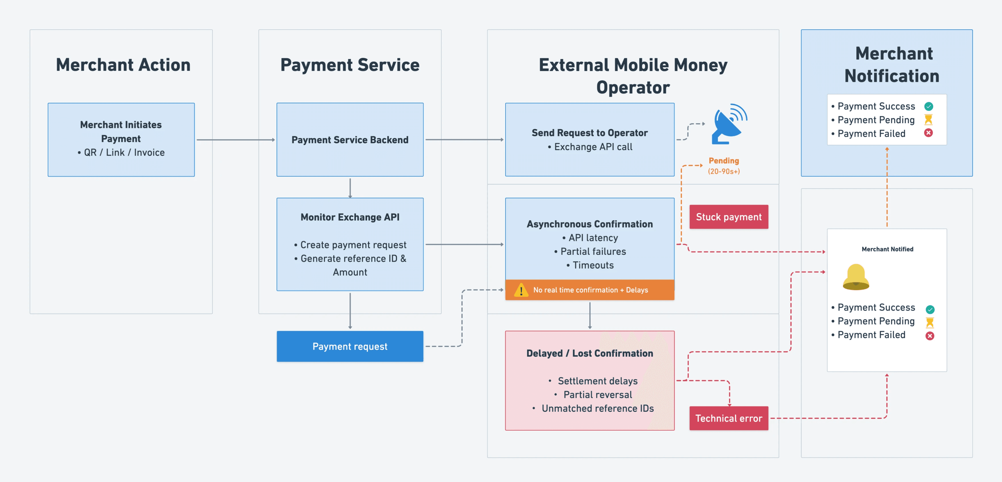
Understanding how technical constraints directly shape merchant experience and trust
Mapped discrepancies between operator APIs, confirmation models, and settlement mechanisms.
Identified bottlenecks in reconciliation, exception handling, and settlement visibility.
Assessed how technical constraints directly shaped merchant experience and operational load.
Key Findings
Slow settlements directly harm merchant cash flow and trust.
Hidden fees reduce transparency and long-term adoption.
Mobile Money UX is not designed for merchant workflows.
Inconsistent confirmations create anxiety and support dependency.
Merchants need one unified dashboard across channels and providers.
Simplicity is mandatory due to low digital literacy in parts of the market.
QR code payments enable faster, more reliable checkout and cash-in.
Support teams compensate for UX and service gaps instead of scaling operations.
Customer Journey Mapping

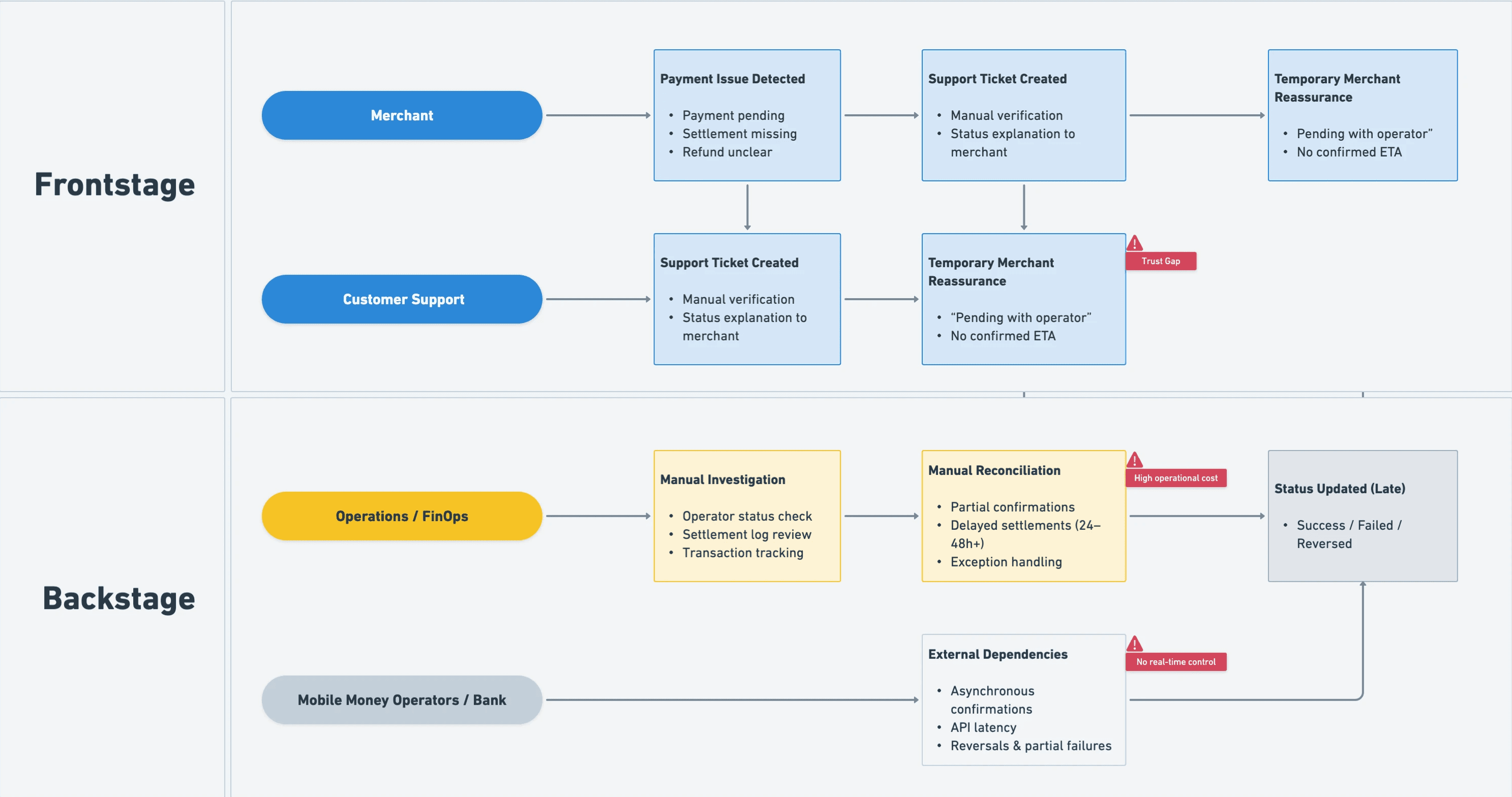
Discovery insights were synthesized into an end-to-end merchant journey to identify moments of friction, trust breakdown, and operational dependency across the payment lifecycle.
Problem definition
Core Problem
Because mobile money systems are fragmented (Wave, Orange Money, Free Money, MTN Money…), each with different flows, errors, timings, and messages, merchants must navigate multiple dashboards and rely on delayed SMS confirmations. They lack clear visibility on payment status, settlement timing, and errors.
As a result, trust in digital payments is low, support teams are overloaded, and merchants struggle to run their business efficiently.

Consequences
Low trust in digital payments
Heavy support and reconciliation workload
Merchants struggle to operate efficiently day-to-day
Solution

Web and Mobile App
An intuitive and consistent experience across web and mobile, designed for fast, simple, and reliable transactions anytime, anywhere.
Adapted to the Local Market
Payment features built around local habits, languages, and Mobile Money usage, tailored to the realities of West African merchants.
No Bank Account Required
A wallet-first experience that allows merchants to receive, store, and manage funds without needing a traditional bank account.
Funds Available Immediately
Instant payments via QR code using Mobile Money and Bank Cards, or direct transfer, with clear visibility on balances and fund availability.
Effortless Onboarding
A quick and simplified registration and KYC process, designed to be accessible even for users with low digital literacy.
Concept & Structure
Information Architecture
Designed a lightweight structure aligned with merchant mental models:
Dashboard • Payments (Payment link, Invoices, Virtual Terminal) • Wallet • Clients • Products • Users • API • Settings

Core UX Concept
The UX concept of Bictorys is built around unifying fragmentation and reducing uncertainty in the African payment ecosystem.
Instead of forcing merchants to navigate multiple dashboards (Wave, Orange, Free, MTN…), interpret inconsistent SMS confirmations, or rely on opaque operator processes, Bictorys provides a single, coherent payment experience across all channels.
The experience is anchored on:
One unified dashboard for all payment methods
Mobile Money, bank cards, QR code payments, virtual terminal (POS-like payments), invoices, and cash-in flows are managed from one place.
One universal payment language
A consistent status model — Success / Pending / Failed — applied across all channels and operators.
One transaction narrative
Each payment is explained through a visual timeline (initiated, operator processing, confirmation, settlement), making backend processes understandable.
One clear merchant wallet
A transparent view of balances, pending amounts, settlements, and availability of funds.
Fast checkout through QR Code & Virtual Terminal
QR Code payments enable instant, error-free checkout and cash-in without manual amount entry.
Virtual Terminal (POS-like) allows merchants to initiate payments directly for card or Mobile Money when needed.
One localized onboarding experience
Simplified onboarding and KYC flows adapted to local contexts and digital literacy levels.
UX Flow Mapping
Because Bictorys clarifies how users interact with the system, the payments, how money moves, and how the system should communicate at every step.

End-to-End Merchant Experience Flow
Unified Payments Dashboard (*)
One Universal Payment Language
One Transaction Narrative
One Clear Merchant Wallet
Fast Checkout with QR Code & Virtual Terminal (**)
KYC Onboarding Flow (***)
Ideation
Wireframes
Explored structure, clarity, and prioritisation:
Dashboard overview
Transaction list
Payment link
Invoicing
Virtual Terminal (Cash in)
Wallet balance & settlements
KYC flow
UI Design
Created a modern, calm and trustworthy visual language:
Strong readability & spacing
Clear hierarchy
Intuitive table interactions
Status colour-coding (green/yellow/red)
Accessible forms & simple labels
Design System
Built a fully reusable DS for engineering:
Color tokens
Typography scale
Components (tables, badges, inputs, cards)
Timeline component
Responsive rules
Set of few elements in my design system


(**) Payment Link
Less than 4 seconds to create and send the link

(*) Build trust with identity + KYC surface
The dashboard unifies all payment channels into one clear view, giving merchants instant visibility of their money. With simplified statuses, real-time insights, and quick-access actions, it reduces complexity and builds trust, especially for users with low digital literacy.


Validation
How we tested
Merchant walkthroughs (remote & in-person)
Internal testing with Support & FinOps
Iterations based on comprehension tests
Key Improvements from Testing
Simplified status terminologyReordered dashboard elements by user priorityEnhanced transaction detail with clearer wordingReduced friction in onboarding stepsImproved empty and error states
CX Contribution
Although my primary role was UX/UI, I also improved CX by:
Writing
clear, human notification templates(SMS, email, in-app)(*)Designing the Transaction Timeline to reduce uncertainty
Standardizing terminology for Support, Ops, and UI
Contributed on Documentation for Developers to ease onboarding and API integration (**)Creating clear error explanations (instead of operator codes)
Result:
(*) Email template
Clear, simple and intuitive

(**) Documentation

Impact
User Impact
Clearer understanding of money movement
Lower stress around payments
Faster task completion
Business Impact
+440% increase in transaction volume
25% faster product iteration cycles
Significant reduction in support tickets
Stronger brand credibility
Bictorys led to a 440% increase in transaction volume and over 15× more monthly transactions within nine months. This growth demonstrates how clarity, transparency, and a unified dashboard directly improved merchant trust and adoption.
